When I'm putting a digital design together, I often start with the background. Even if I have a wonderful image I want to feature, the background has to be right, or I'm not happy. I love using words for the background, especially vintage printed or handwritten words. You can do so much with them, to alter or change their appearance.
If I'm working digitally, it's easy to do with blending and adding layers. But even if you're working with paper, there are lots of possibilities.
Consider using a sponge and a stamp pad to add color and texture. Ink the edges, or use an almost dry stencil brush to add a different look. Find a pattern stamp and use that to alter the background. Add a layer of tissue or velum to soften the look.
You get the idea, I'm sure - the more things you try, the more possibilities. Keep a little workbook or notebook and jot down the things you did to get an effect you like, so you can remember how you did it.
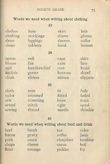
Here are a couple of background pages for you to play with. The first is from "The Test and Study Speller", 1921. Click on the image to enlarge it and save.

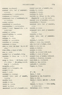
The second page is from "Le Premier Livre", 1915, and is of course, in French. Tres chic', n'est pas?

The Dog is astounded that I remember that much of my high school French. After all, that was 350 years ago in dog years.

Jan, these are all great tips and thanks for the goodies!
ReplyDeleteWhere did you learn Photoshop?? I am struggling with it. Took an online class that was too advanced for me. I do enjoy playing with the filters but layers still puzzle me!
Will be playing with the scans I bought from you soon!
Hugs!
Diane